Damask, Ditsy or Botanical? A Small Pattern Glossary
With the right words, you can change the world
E.B. White (Charlotte’s Web)
Wallpaper has its own vocabulary. We speak of damask, botanicals and ditsy florals as though everyone knows exactly what they mean. But stand in front of a wallpaper sample for long enough, and you will soon hear one mistaken for another.
People will sometimes look at a wallpaper sample and call it a damask when it’s actually a botanical. Or they'll use the word ditsy to describe something far too grand to earn that word.
Language around pattern can be loose, and mostly it doesn't matter.
But often I think it is worth untangling, if only because knowing the names makes it easier to know what you actually love.
Damask is the oldest of the three, and it carries itself that way. It began as a woven fabric, not a printed one. Traditionally woven in a single colour, the pattern reveals itself through the interplay of matte and sheen, the design appearing and disappearing depending on how the light falls across it. When damask is printed today, it echoes that same sense of formality: symmetrical, often floral or scrolling acanthus leaves, built around a mirrored repeat. Damask wants a wall to itself. It doesn't ask to be paired with much.
Ditsy sits at the other end of the room entirely. It's a small-scale, densely repeated print, usually floral, usually unfussy; the kind of pattern you'd find scattered across a flowy, summer dress or a cottage curtain. The word itself comes from ditsy, meaning scatter-brained or slight, and there's something honest in that. Ditsy prints don't aspire to be the main event. They're happy as a lining, a cushion back, a quiet layer underneath something louder.
Botanical is the broadest of the three, and the one most often used loosely, myself included. Technically, it simply means a design based on plant life. In practice, botanical prints tend to sit somewhere between damask's formality and ditsy's delicacy. They can be large-scale or intimate, symmetrical or wandering, but they usually keep some trace of how a plant actually grows. A botanical print still remembers that it once looked at a stem…if you know what I mean.

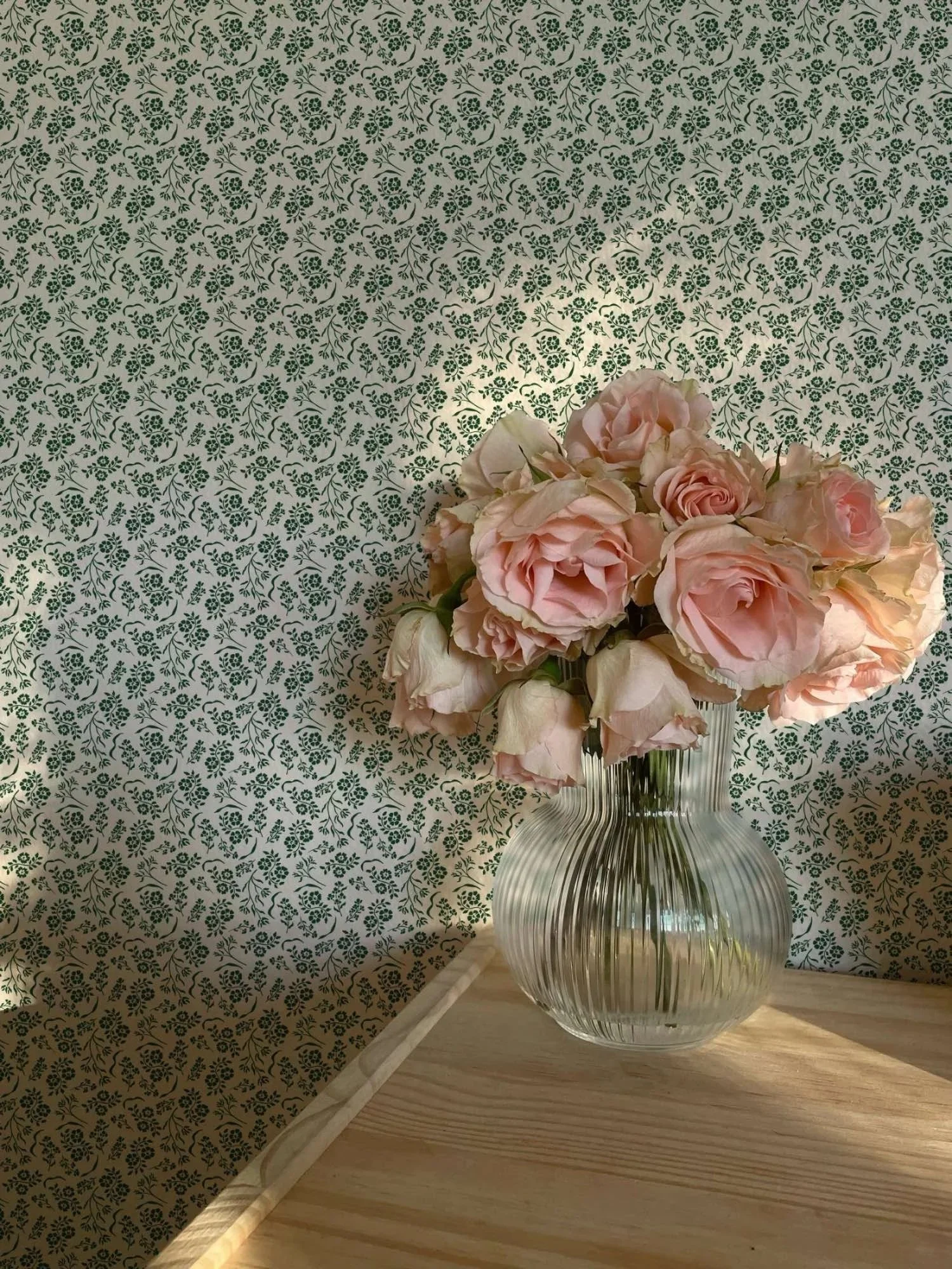

I find myself drawn to all three at different times, for different rooms and different reasons. A damask for when a space needs a sense of occasion. A ditsy when it needs softening or a touch of whimsy. A botanical when it needs to breathe a little, almost as if it’s remembering that it's connected to something growing just beyond the window.
None of this changes how a print should make you feel in a room. A name isn’t meant to do that; let the design have the effect. But there is a particular pleasure in being able to say, with some confidence, this is a damask, or this is botanical, and knowing exactly why.
Perhaps that’s one of the pleasures of learning the language of pattern. It doesn’t change what you love, but it gives shape to instincts you’ve probably had all along.
Do you already know which of the three you reach for? Or has your eye changed over time?